What six of the best TV shows would look like if Wes Anderson directed them
There’s nothing quite like a Wes Anderson movie. The acclaimed director of The Grand Budapest Hotel is a bonafide auteur with an unmistakable style that can be imitated but never truly captured.
But the design team from Angi decided to give it a go anyway.
They redesigned six sets from popular TV shows based on the look and feel of Anderson’s impressive body of work.
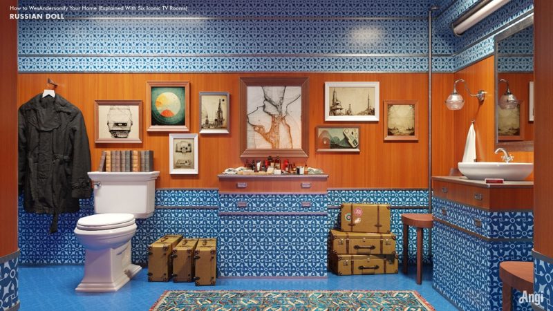
Russian Doll
The Netflix comedy-drama Russian Doll has all the makings of a Wes Anderson classic. It follows the (repeated) adventures of 36-year-old Nadia, a New York singleton who gets stuck in a time loop where she attends the same party over and over again. Think Sex in the City meets Groundhog Day. Every new loop begins with Nadia waking up in the same bathroom. Here’s what that room would look like if Andeson had directed Russian Doll.
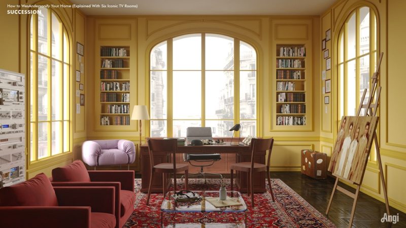
Succession
If you haven’t seen HBO’s smash hit comedy/drama Succession, then what are you even doing with your life? Seriously. It’s the greatest TV show EVER. Fact.
What would the Roy family patriarch Logan Roy think of this Wes Anderson-inspired summerhouse office? The notoriously hard-to-please media tycoon would probably have a few choice words for the designer – and we can’t repeat those here.
And what would Roman Roy get up to if left alone in this office? Hint: that’s one mess you wouldn’t want to clean up. Succession superfans know what we’re referring to. He’s one sick little puppy.
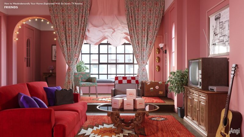
Friends
This is the “One Where Wes Anderson Redesigns Monica’s Living Room.” The pastel colour scheme and attention to detail screams out, “Wes Anderson!” But would Monica appreciate the restyling? Probably not. She once spent an entire episode freaking out over her bath towels hanging in the wrong direction. Change is not Monica’s thing.
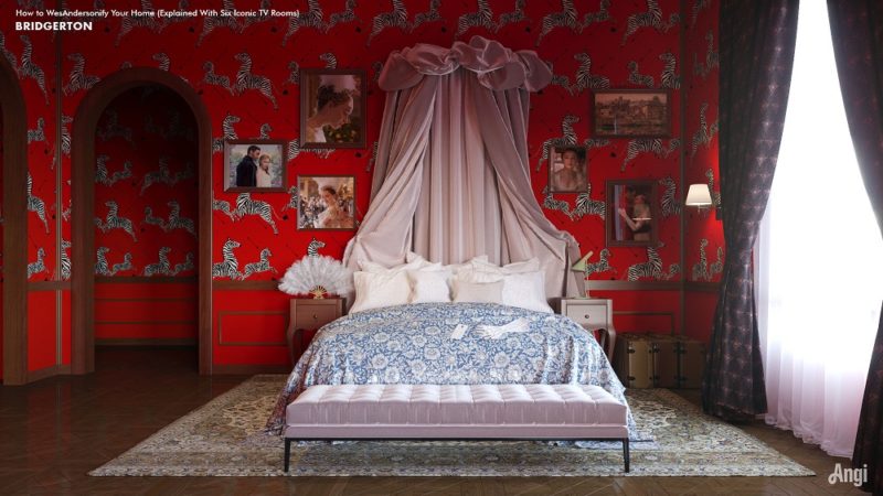
Bridgerton
The US American historical-romance television series Bridgerton is ideal Wes Anderson source material. And that’s precisely why Angi designers used his unique aesthetic sensibility to re-imagine Daphne’s bedroom. Bold colours, clinical straight lines, a dash of opulence, and flawless symmetrical precision: it’s the type of room that only Wes Anderson (or someone copying Wes Anderson) could create.
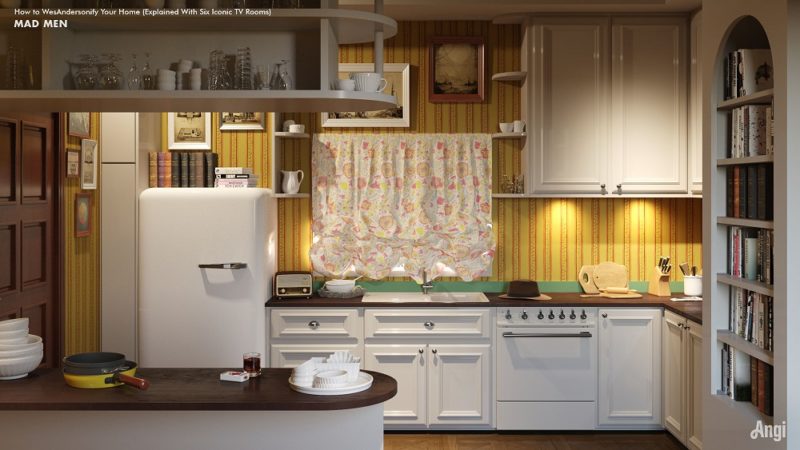
Mad Men
The Wes Anderson touch adds a slightly surreal feel to the conservative stylings of Don and Betty Draper’s kitchen. It’s a room that contains all the trappings of the great American dream. To an outsider looking in, it seems perfect. But stare long enough, and you’ll sense something isn’t quite right here. Just like the leading ‘mad man’ himself – Donald Draper (or is it really Dick Whitman?)
Sex Education
Netflix’s hilarious comedy “Sex Education” is about as British as British gets. And so is this Wes Anderson-inspired take on the attic bedroom belonging to the show’s main character, Otis. The design borrows from Anderson’s “Fantastic Mr Fox” aesthetic to create a brown and mustard colour scheme, complete with 1980s retro furniture that wouldn’t look out of place in Adrian Mole’s bedroom. This is the interior design version of pie, mash, mushy peas, and a boatload of gravy.
Colourful, dreamlike, eerie and yet oddly familiar; it’s the wonderful world of Wes Anderson.

